Understanding the Psychrometric Chart
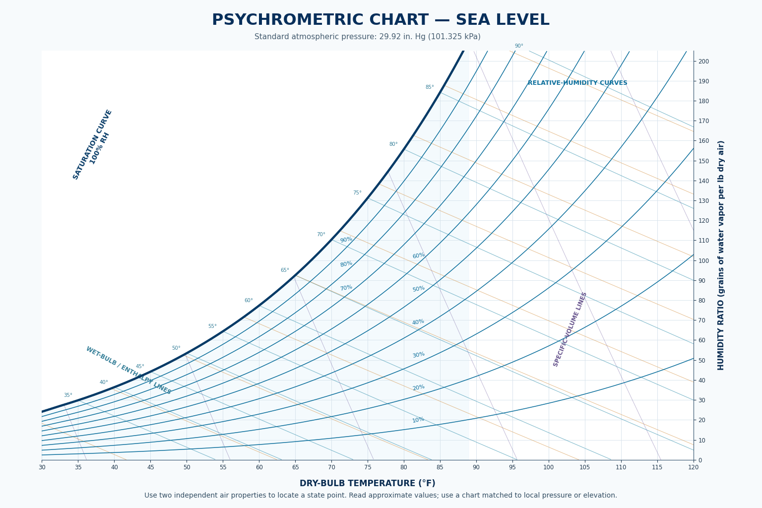
A psychrometric chart is a graphical map of moist-air properties at a specified barometric pressure. It brings dry-bulb temperature, wet-bulb temperature, relative humidity, humidity ratio, dew point, enthalpy, and specific volume together on one chart.
This lesson introduces the chart’s major regions and line families. The goal is to recognize what each line represents and where its scale is read before plotting conditions and following HVAC/R processes in later lessons.
What You Will Learn
Explain what a psychrometric chart represents.
Identify the dry-bulb temperature and humidity-ratio scales.
Recognize relative-humidity curves and the saturation curve.
Recognize wet-bulb, enthalpy, and specific-volume line families.
Explain why two independent properties locate an air state.
Select a chart for the correct pressure, elevation, temperature range, and units.
A Map of Moist-Air Conditions
A psychrometric chart graphically represents thermodynamic properties of moist air. Instead of calculating every property separately, a technician can locate one air-condition point from two independent measured properties and then estimate several other properties from the same point.
The chart can also show how air changes through heating, cooling, humidification, dehumidification, and mixing. Each air condition is shown as a state point, and a line connecting two state points represents the process that moved the air from one condition to another.
A precisely marked point based on poor measurements still produces poor results. Verify instrument condition, measurement location, stabilization, units, and chart selection before using the chart for diagnosis.
Start with the Bottom, the Side, and the Curved Boundary
The normal-temperature psychrometric chart has an irregular curved shape. Three features provide the easiest starting points: dry-bulb temperature along the bottom, humidity ratio along the side, and the 100% relative-humidity saturation curve forming the upper-left boundary.
Bottom Scale
Dry-bulb temperature increases from left to right. Lines of constant dry-bulb temperature extend upward through the chart and appear nearly vertical.
Side Scale
Humidity ratio increases from bottom to top. Lines of constant humidity ratio extend horizontally across the chart.
Curved Boundary
The saturation curve is the 100% relative-humidity line. It is also used to read dew-point temperature from a state point.
Charts may use degrees Fahrenheit or Celsius and may express humidity ratio as grains per pound, pounds of water per pound of dry air, or grams of water per kilogram of dry air. Never assume the scale or units from the chart’s general appearance.
Each Direction Represents a Different Property
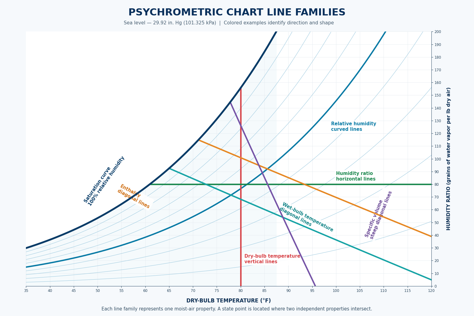
The chart contains several groups of lines. Lines in the same family represent constant values of one property. Learning the direction and scale of each family prevents the common error of following the wrong line through a state point.
Dry-Bulb Temperature
Nearly vertical straight lines rise from the bottom temperature scale. Moving right means a higher dry-bulb temperature.
Humidity Ratio
Horizontal lines run from the humidity-ratio scale toward the saturation curve. Moving upward means more water vapor per mass of dry air.
Relative Humidity
Curved lines sweep upward from left to right. The curves are commonly labeled in percentages between 10% and 100%.
Wet-Bulb Temperature
Diagonal lines slope downward from left to right and begin on the saturation curve at their labeled wet-bulb temperatures.
Enthalpy
Diagonal enthalpy lines run in nearly the same direction as wet-bulb lines, but the two line families are not exactly the same.
Specific Volume
Straight diagonal lines slope upward from left to right and represent air volume per unit mass of dry air.
On many charts the two families appear almost parallel and are sometimes treated as approximately aligned for quick field work. For careful reading, follow the correct printed line to its own scale.
The Main Coordinates of the Chart
Dry-bulb temperature and humidity ratio provide the basic position of a state point. Moving horizontally changes dry-bulb temperature while humidity ratio remains constant. Following a constant dry-bulb line upward or downward changes humidity ratio while dry-bulb temperature remains constant.
Dry-Bulb Temperature Changes
A horizontal movement represents sensible heating or cooling when no water vapor is added, removed, or condensed.
Humidity Ratio Changes
Following a constant dry-bulb line upward represents moisture addition at that temperature; following it downward represents moisture removal at that temperature.
These directions are building blocks: Actual HVAC/R processes may change temperature and humidity ratio at the same time, so their process lines move diagonally or along a curve rather than purely horizontal or vertical.
The 100% Relative-Humidity Boundary
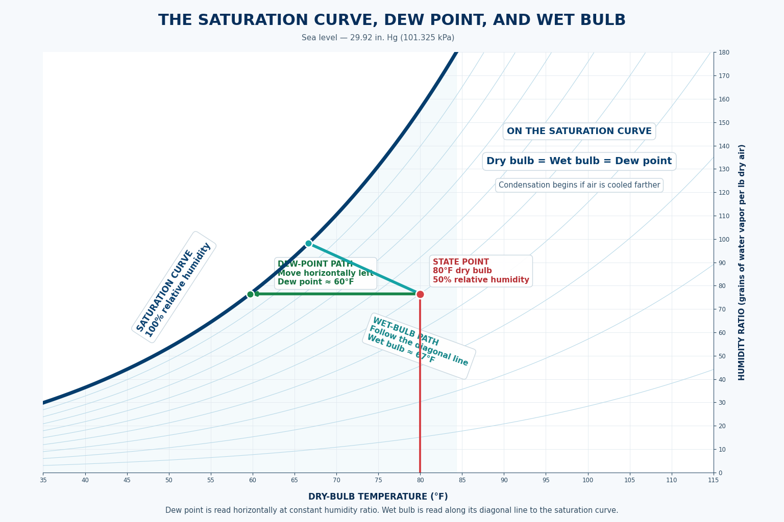
The saturation curve forms the chart’s upper-left boundary and represents 100% relative humidity. At every point on this curve, dry-bulb temperature, wet-bulb temperature, and dew-point temperature have the same numerical value.
The curve also shows that saturation humidity ratio increases as temperature rises. A higher-temperature saturated state contains more water vapor per pound of dry air than a lower-temperature saturated state at the same pressure.
Read Dew Point
From a state point, move horizontally left at constant humidity ratio until reaching the saturation curve, then read the temperature at that location.
Recognize Saturation
A point on the curve is saturated. Under normal chart conditions, an ordinary moist-air state without fog lies on or below and to the right of the curve.
Follow Condensation
Cooling at constant humidity ratio reaches the curve at the dew point. Continued cooling with moisture removal moves downward along or near the saturation region.
Curved Lines Show Closeness to Saturation
Relative-humidity lines curve across the chart between the dry-air region and the saturation boundary. Common charts label these curves at 10% intervals, with the outer saturation curve representing 100% relative humidity.
Following a horizontal constant-humidity-ratio line to the left shows relative humidity increasing as dry-bulb temperature falls. Following the same line to the right shows relative humidity decreasing as dry-bulb temperature rises.
If a state point falls between two printed relative-humidity curves, estimate the value according to its position between them. Do not move the point onto the nearest curve simply because it is easier to read.
Find the Intersection of Independent Measurements
A single property normally identifies an entire line rather than one unique air condition. For example, 75°F dry-bulb temperature can exist at many humidity levels. A second independent property is needed to locate one state point.
Dry-Bulb and Wet-Bulb
Locate the dry-bulb line and the wet-bulb line. Their intersection identifies the air state.
Dry-Bulb and Relative Humidity
Locate the dry-bulb line and the correct relative-humidity curve. Their intersection identifies the air state.
Dry-Bulb and Dew Point
Use dew point to establish the horizontal humidity-ratio line, then intersect it with the measured dry-bulb line.
Do not combine a return-air dry-bulb temperature with a supply-air relative humidity or measurements taken at different operating times. Both values must represent the same airstream, location, pressure, and stable condition.
Use a Chart That Matches the Air Pressure
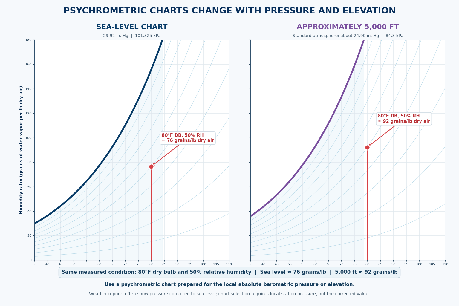
Psychrometric relationships depend on total barometric pressure. A chart is constructed for a stated pressure or elevation, and using the wrong chart can produce errors in humidity ratio, enthalpy, specific volume, and other calculated properties.
ASHRAE publishes normal-temperature charts for sea-level pressure and selected higher elevations. Electronic psychrometric tools may allow the user to enter local pressure or elevation, but the setting must still be checked before the results are accepted.
Check the Chart Heading
Confirm the stated barometric pressure or elevation before plotting any measurements.
Check the Temperature Range
Use a normal-, low-, high-, or very-high-temperature chart that includes the measured condition.
Check the Units
Confirm Fahrenheit or Celsius and verify the humidity-ratio, enthalpy, and specific-volume units.
Check Electronic Settings
Verify pressure, elevation, units, and sensor inputs before relying on software-generated properties.
Field judgment: A sea-level chart may be adequate for some approximate low-elevation field checks, but it should not be treated as universally correct. Use the applicable chart, pressure correction, software setting, or project requirement when elevation or accuracy matters.
Approach the Chart the Same Way Each Time
1. Verify the Chart
Check pressure or elevation, temperature range, and units.
2. Identify Two Properties
Confirm that both measured values represent the same air condition.
3. Follow the Correct Lines
Trace each property’s line family carefully and mark their intersection.
4. Read Other Properties
Follow the appropriate lines from the state point to the correct scales.
5. Estimate Between Lines
Interpolate when the point falls between printed values rather than forcing it onto a line.
6. Check Reasonableness
Confirm that the chart results agree with the measurements and the physical condition of the system.
Avoid These Chart-Reading Errors
“One temperature locates the air condition.”
One property normally identifies a line. A second independent property is needed to identify a unique state point.
“Every diagonal line is wet-bulb.”
Wet-bulb, enthalpy, and specific-volume lines are all diagonal, but they have different directions, labels, and scales.
“Wet-bulb and enthalpy lines are identical.”
They are close on many charts but are not exactly the same line family. Follow the correct printed line for careful work.
“All psychrometric charts give the same result.”
Charts vary by pressure, elevation, temperature range, coordinate system, and units.
“The chart is too exact to require judgment.”
Line thickness, printing, interpolation, measurement uncertainty, and chart selection limit the precision of a hand-read result.
“Software removes the need to check pressure.”
Electronic tools still require correct pressure or elevation, units, and measurement inputs.
Can You Identify the Psychrometric Chart’s Main Features?
- What does a psychrometric chart graphically represent?
- Where is dry-bulb temperature read?
- In what direction do constant humidity-ratio lines run?
- What does the saturation curve represent?
- How is dew-point temperature found from a state point?
- Why does one property normally not identify a unique state point?
- Name three pairs of properties that can locate an air condition.
- Which line families are diagonal and can be confused with one another?
- Why must wet-bulb and enthalpy lines be followed separately for careful work?
- Why does chart pressure or elevation matter?
- What chart information should be checked before plotting?
- Why should a chart result be checked for reasonableness?
What You Should Have Learned
A psychrometric chart graphically represents moist-air properties at a specified barometric pressure.
Dry-bulb temperature is read along the bottom, and humidity ratio is read from the side scale.
The saturation curve is the 100% relative-humidity boundary and is used to read dew-point temperature.
Relative humidity is shown by curved lines, while wet-bulb, enthalpy, and specific volume use different diagonal line families.
Wet-bulb and enthalpy lines appear close on many charts but are not exactly identical.
Two independent properties describing the same air condition are normally required to locate one state point.
Chart pressure, elevation, temperature range, and units must be checked before plotting or reading properties.
Hand-read chart values are estimates and must be interpreted with measurement accuracy and system conditions in mind.